How to Refresh Your Beach Cottage Color Palette for Spring (On a Budget)
This post may contain affiliate links. If you make a purchase through one of my links, I may receive a small commission at no cost to you.
Spring is the perfect time to shake off the winter heaviness and give your beach cottage a fresh, light-filled look without a full renovation or a big budget. After three seasons of owning our tiny 800-square-foot coastal retreat, I've learned that the right color updates can make even the smallest space feel completely transformed.
In this post, I'm sharing exactly how I refresh our beach cottage color palette each spring: which accent colors actually work in a small coastal space, what's trending that isn't just a gimmick, and how I did a full seasonal refresh for under $200 in a single Saturday afternoon.
Key Takeaways
You can fully refresh a beach cottage's color palette for under $200 by swapping textiles and adding a few well-chosen accents.
A tight color story of four families (neutrals, your signature blues, two seasonal accents) keeps small spaces feeling cohesive rather than cluttered.
Warm neutrals, seafoam greens, and soft terracotta are the current trends that actually translate well to real coastal homes.
Paint remains the highest-impact, lowest-cost update, especially on ceilings and small accent surfaces like vanities and interior doors.
Why Spring Is the Best Time to Update Your Coastal Color Palette
When I opened up our cottage after this past winter, I was struck by how flat everything looked. The blues and whites that felt so crisp last summer had dulled. It's not that the colors were wrong. It's that every space needs a seasonal reset, especially one that lives through salty air and sandy feet year-round.
The good news is that you don't need to repaint every wall or buy new furniture. A few intentional swaps in your color story go a very long way in a small space.
The Accent Colors Transforming Our Cottage This Spring
Our backbone stays the same: white and cream walls with classic coastal blues. But spring is when I introduce accent colors that feel fresh and seasonally appropriate.
Coral: Instant Warmth
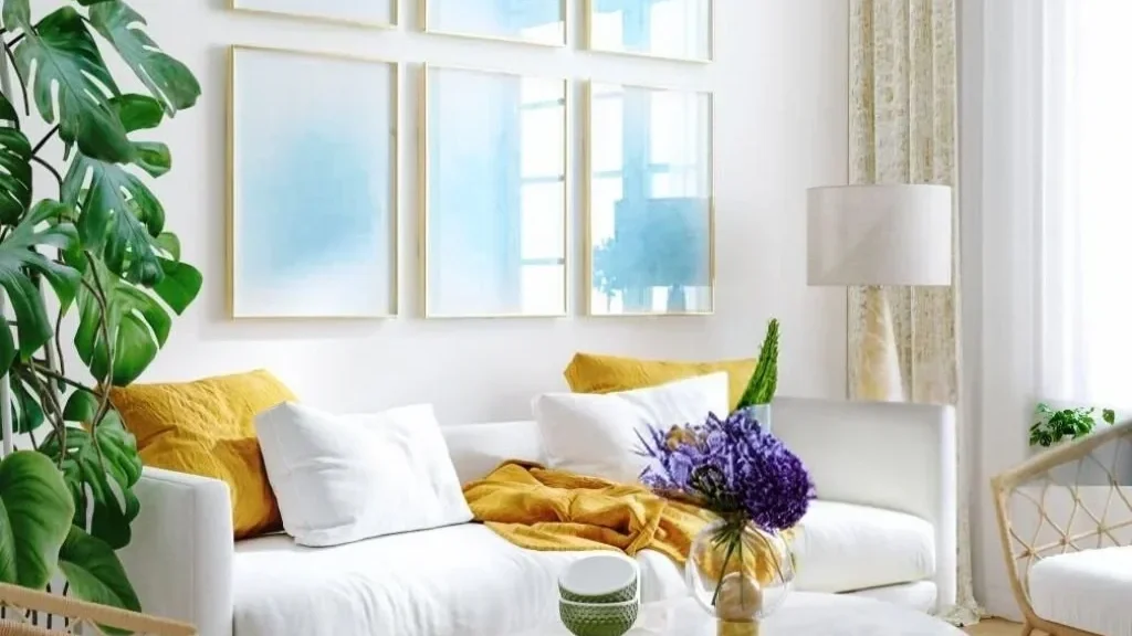
Adding just two coral throw pillows to our white slipcovered sofa made my husband ask if we'd gotten new furniture. That warm peachy-pink glow makes the living area feel like it's bathed in sunset light, even on overcast days. Look for coral in cotton or linen textures. They keep it feeling casual and beachy rather than formal.
Seafoam/Mint: A Happy Accident
I wasn't planning to add green to our cottage until I found a vintage seafoam glass bottle at the flea market. Now it's woven throughout the space, and I even painted the inside of our front door this color (my husband was horrified, then delighted). It adds an organic, springy freshness that works beautifully against our existing blues.
Soft Butter Yellow: The Secret Weapon
Yellow can feel tricky, but a muted, buttery shade is far more versatile than you'd think. The key is small doses only: a ceramic bowl on the coffee table, a lightweight throw on the reading chair. It adds cheerful warmth without overwhelming a small room.
The rule I follow: Pick your three accent colors and don't stray from them, no matter how much you love that purple lamp at HomeGoods.
What's Actually Trending This Year
I take design trends with a grain of sea salt, but this year's directions genuinely work in a coastal small-space context.
Warm neutrals are replacing cool grays. That cool gray-everything era is over, and not a moment too soon. The warmer, earthier neutrals trending now pair beautifully with coastal palettes and feel much more welcoming in a lived-in beach space.
Terracotta as an accent (not an overwhelming statement). I painted our tiny bathroom vanity a muted terracotta and paired it with sage green hand towels. The combination feels both current and timeless, like it's always belonged in the cottage.
Nature-inspired greens. Sage, olive, and seafoam are showing up everywhere, and they layer incredibly well with the blues already in most coastal homes.
Building a Color Story for a Small Space
When you're decorating 800 square feet, visual chaos can happen fast. My first spring, I went color-wild and ended up with what my sister lovingly called "the beach cottage that threw up a rainbow."

Here's the color story I'm working with right now and how it flows from room to room:
White and cream — walls, major furniture, curtains
Medium and light blues — upholstery, bathroom tile, throw blankets
Coral and butter yellow — accent pillows, small ceramics, lightweight throws
Seafoam — small decorative accents, the front door interior
Four color families. That's it. Everything else gets a hard no, no matter how cute it is at the store.
My $200 Saturday Afternoon Refresh
Between work and actually enjoying beach time, I'm not spending entire weekends on decor projects. Here's what I did in one afternoon that made a huge difference:
Swapped throws — traded heavy navy blankets for lightweight cotton ones in coral and butter yellow
Changed pillow covers only — kept the same inserts (this is a game-changer for budget decorating, since you only need to buy covers)
Added a new indoor/outdoor rug — a subtle seafoam pattern that ties the room together and survives sandy feet
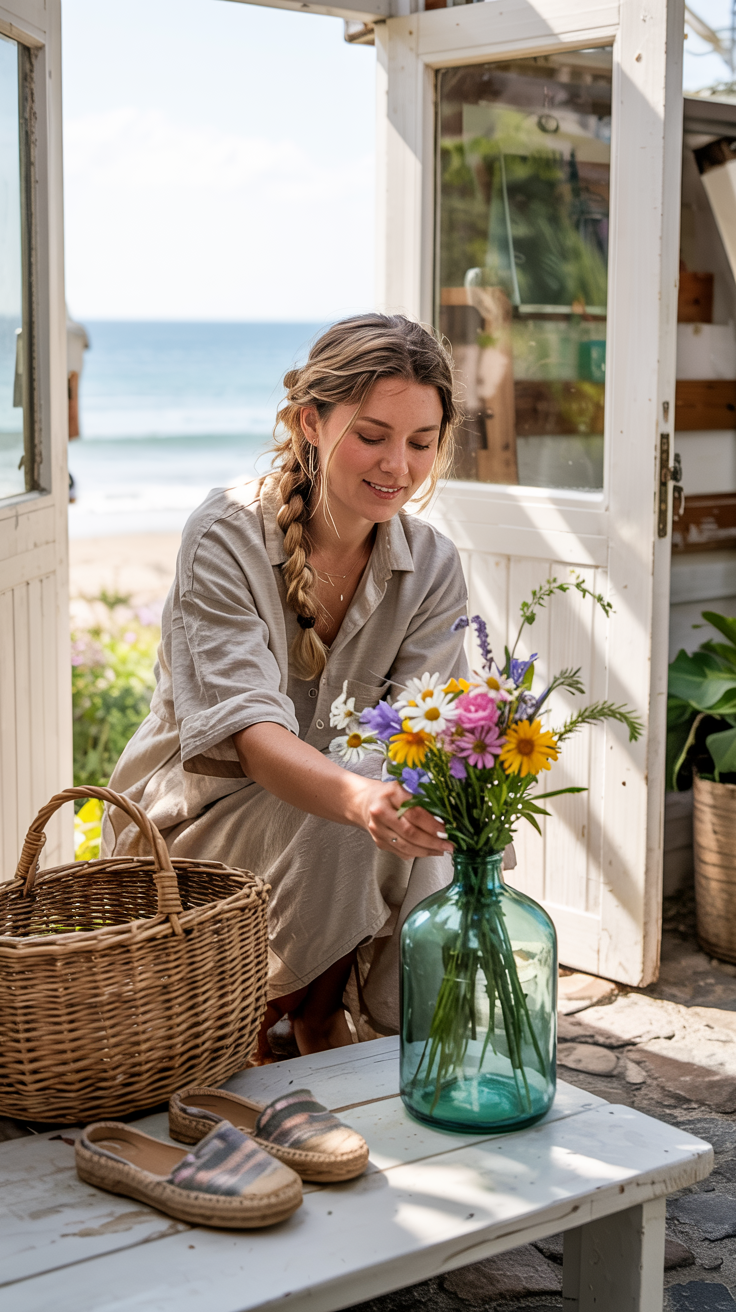
Styled the vintage bottles — grouped a few seafoam and clear glass bottles with some spring wildflowers for the entryway table
Total cost: under $200. Total time: one Saturday afternoon.
Paint Tips for Small Beach Cottage Spaces
If you're ready for a slightly bigger project, paint is still the best bang for your buck.
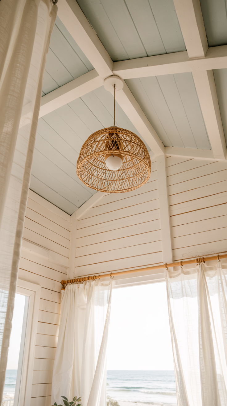
Ceiling trick that always surprises guests: I painted our ceiling in Benjamin Moore "Morning Sky," the palest blue-white you can imagine. Every single visitor asks why our ceilings feel so high. They're not. It's the color doing all the work.
Color blocking for open floor plans: Our main living area has to function as a living room, dining area, and occasional home office. I used subtle color blocking to visually separate the zones without adding walls. It makes the space feel intentional rather than cramped.
Pro tip for small rooms: Always test paint in your actual space before committing. Coastal light (especially the reflected light off water or sand) reads very differently than a paint chip under store lighting.
The Real Secret to a Beautiful Beach Cottage
Here's my confession: behind every pretty coastal vignette in our cottage is a basket of sandy shoes, a drawer of tangled cords, and my husband's collection of half-empty water glasses on every surface.
Real beach life is delightfully messy. That's exactly why seasonal color refreshes matter. When the major elements feel intentional and cohesive, the everyday chaos of beach living feels charming rather than chaotic.
The goal isn't a showroom. It's a space that welcomes sandy feet, salt-kissed hair, and impromptu neighbor gatherings when the sunset is too good not to share.
Your Spring Color Refresh Checklist
Use this as your action plan before the season gets away from you:
Write down your base palette (your year-round neutrals and one or two signature colors you'll keep no matter what).
Choose two or three seasonal accent colors for spring and commit to them before you shop.
Start with textiles first. Swap pillow covers, throws, and a lightweight rug before spending anything on paint or furniture.
Add fresh botanicals or a cluster of vintage glass bottles for organic, inexpensive color.
Pick one paint project to tackle this season, whether it's a ceiling, a vanity, or the inside of your front door.
Stick to your palette. Step away from the purple lamp.
Spring Refresh 2025: How to Update Your Beach Cottage with Indoor Coastal Plants
Frequently Asked Questions Beach Cottage Spring Color Palette
What are the best colors for a beach cottage in spring?
The most effective spring palettes for coastal spaces build on a neutral base (white, cream, or warm greige) and layer in seasonal accents. Coral, soft butter yellow, and seafoam or mint green are all excellent choices because they feel bright and fresh without competing with the natural light and blue tones that coastal homes are known for.
How do I update my beach cottage decor without spending a lot of money?
Start with textiles. Swapping pillow covers (not the whole pillow), replacing heavy winter throws with lightweight cotton blankets, and adding a new indoor/outdoor rug can completely change the feel of a room for well under $200. These are also easy to switch back out next season, which makes them a smart long-term investment.
How many colors should a small beach cottage have?
In a small space, less is always more. A good rule of thumb is to work with no more than four color families: one neutral (walls and large furniture), one signature color (your coastal blues, for example), and two accent colors that you rotate seasonally. More than that and the space starts to feel cluttered rather than curated.
What paint colors work best in a small coastal cottage?
Light, airy shades with warm or cool undertones work best depending on your existing palette. Benjamin Moore "Morning Sky" is a beautiful ceiling color that makes low ceilings feel taller. For walls, look for whites and creams with slightly warm undertones rather than stark bright white, which can feel cold in natural light. If you want to add a trending color, muted terracotta or sage green on a single accent surface (like a vanity or built-in shelf) is a low-commitment way to test it.
When should I refresh my beach cottage decor for spring?
Ideally, aim to do your spring refresh before Memorial Day weekend, especially if your cottage gets heavy use in summer. A single Saturday afternoon in March or April is enough time to swap textiles and style fresh accents. Save any paint projects for a shoulder-season weekend when you're not competing with beach days.